Year
2025
Client
Sama Barakat
Category
Branding
Product Duration
3 - 4 Weeks
The direction began with a single question — what does authority look like? Research focused on real estate brands that communicate trust through restraint. The visual references pulled from heritage crests, institutional typography, and gold as a cultural signifier of value in the GCC market. The goal was to build something that felt established on day one
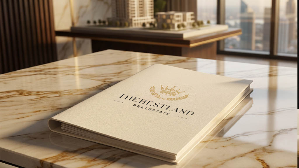
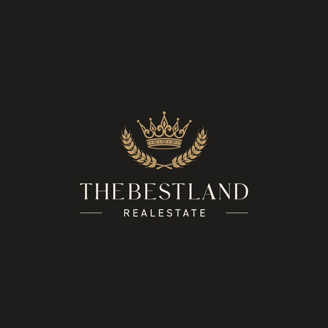
The Best Land identity is built around a crown and laurel mark — symbols of sovereignty and achievement, recontextualized for modern real estate. The typeset wordmark uses a high-contrast serif that carries weight without aggression. Deep black and warm gold form the primary palette — grounded, luxurious, and regionally resonant. Every element is structured to communicate confidence before a word is read.

The system was built for full application — from business cards to office signage to digital presence. The dark palette holds across print and screen with equal weight. The crown mark scales from favicon to billboard without losing presence. The brand was designed to live in boardrooms, proposals, and property listings — anywhere trust needs to be established instantly.

The Best Land is not a startup. It is a statement. The identity communicates that before development, before returns, before growth — land defines possibility. The brand was built to match that belief: composed, forward-looking, and built to last.